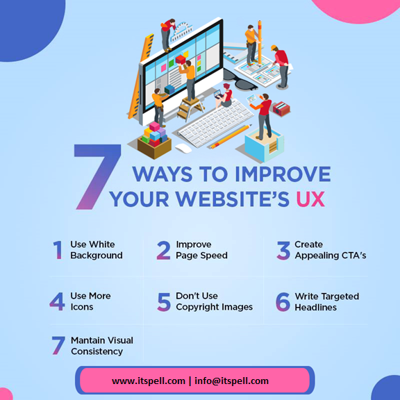
7 Ways to improve your website’s UX
The ways through which you can improve your UX :
• Allow white space:
As a designer, I’ve always believed that whitespace is THE fundamental building block of good design. When designers talk about whitespace, they actually mean negative space, the space between elements in a composition. It is the portion of the page left unmarked; the space between graphics, margins and gutters. It is the space between columns, between lines of type or figures that provides visual breathing room for the eye.
- Improve page speed:
A one-second delay in page load time yields:
- 11% fewer page views
- 16% decrease in customer satisfaction
- 7% loss in conversions
A few extra seconds could have a huge impact on your ability to engage visitors and make sales.
This means that having a fast site is essential — not just for ranking well with Google, but for keeping your bottom-line profits high.
- Create appealing calls to action:
Have you struggled to get visitors to your site to do what you want?
Maybe you want them to sign up for your newsletter, or get a demo of your product, but they never make it to that page?
It may be time to revisit your call-to-action.
A call-to-action (CTA) is a button or link that you add to your website in order to guide your visitor and tell them what to do next.
In inbound marketing, they usually lead to a landing page where the visitor can fill out a form and become a lead.
- Use bullets:
Online users do not read pages word for word. They typically read less than 20% of the words on a page. This means that they skim the content to find the answers to their questions. Overall, bullet points are a really effective tool to help you organize and highlight key information on your website.
- Choose original images:
Don’t just add images at random. Just because you heard that images improve conversions doesn’t mean you should populate your site with random images.
You need to be strategic with your image choice and placement.
For example, if your goal is to boost the sales of a specific product, then include a lot of real pictures of happy customers.
- Write targeted headlines:
There’s no sense in dedicating any time to creating content or running ads if your headlines aren’t compelling. It’s like writing a wonderful book and giving it an awful cover. Potential readers won’t click to read more if there’s nothing to pique their interest.
- Stay consistent:
Consistency is a golden-rule in design. To provide a quality experience to your users it is essential that you are consistent in both design and content of your websites. Consistency is the biggest factor that separates a negative experience from a positive one.
Web elements are the building blocks essentials for a website. Patterns including, header, footer, sidebar, and navigation bar. Web elements are the core framework of your website and they should be kept in the same place to ensure a consistent user experience. Usability of your website should be logical and this can be accomplished with consistency.
These are few ways to improve the UX design and iTspell Technologies is using those ways to provide the unique design to its clients.
Choose iTspell Technologies today: www.itspell.com

